A strong therapist website needs to do more than look polished. It needs to help the right prospective clients feel safe, understood, and ready to take the next step.
The best therapist websites make that happen quickly. They lead with a clear message, create a calm first impression, and make it easy to understand who the practice helps and how to get started.
Below are five therapist websites that do this well. Each takes a slightly different approach, but all of them offer useful lessons for private practices that want a website that builds trust instead of confusion.
Let’s look at five therapist websites that stand out in 2026.
Susan Terkhorn
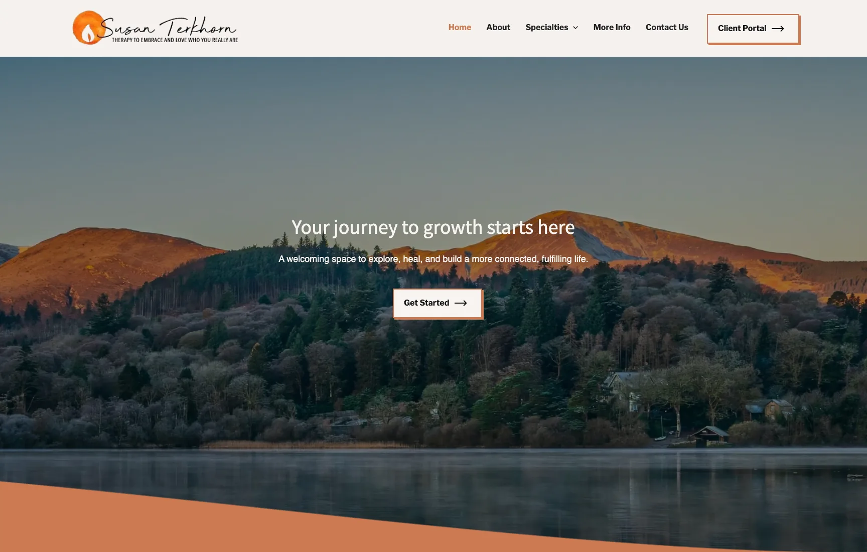
Why Susan Terkhorn’s Website Builds Trust Quickly
Susan Terkhorn’s homepage does a good job of feeling warm, grounded, and easy to understand. It is the kind of site that gives a prospective client a calmer first impression within a few seconds.
A warm first impression
The homepage opens with supportive language, clean spacing, and a tone that feels welcoming rather than overly clinical. That matters in therapy, where many people arrive feeling uncertain before they ever reach out.
Strong testimonials that reduce hesitation
The testimonials are prominent and specific. They help a new visitor move from “This looks nice” to “Other people have felt safe and supported here.” That kind of reassurance is powerful on a therapist website.
Clear pathways into the site
The homepage also makes navigation easy. Specialties, more info, and contact are all clearly surfaced, which gives prospective clients a simple way to keep exploring without guessing where to go next.
The takeaway
This site shows how far a therapist website can go with the right emotional tone, visible trust signals, and clear service pathways.
Kim Hawkins Counseling
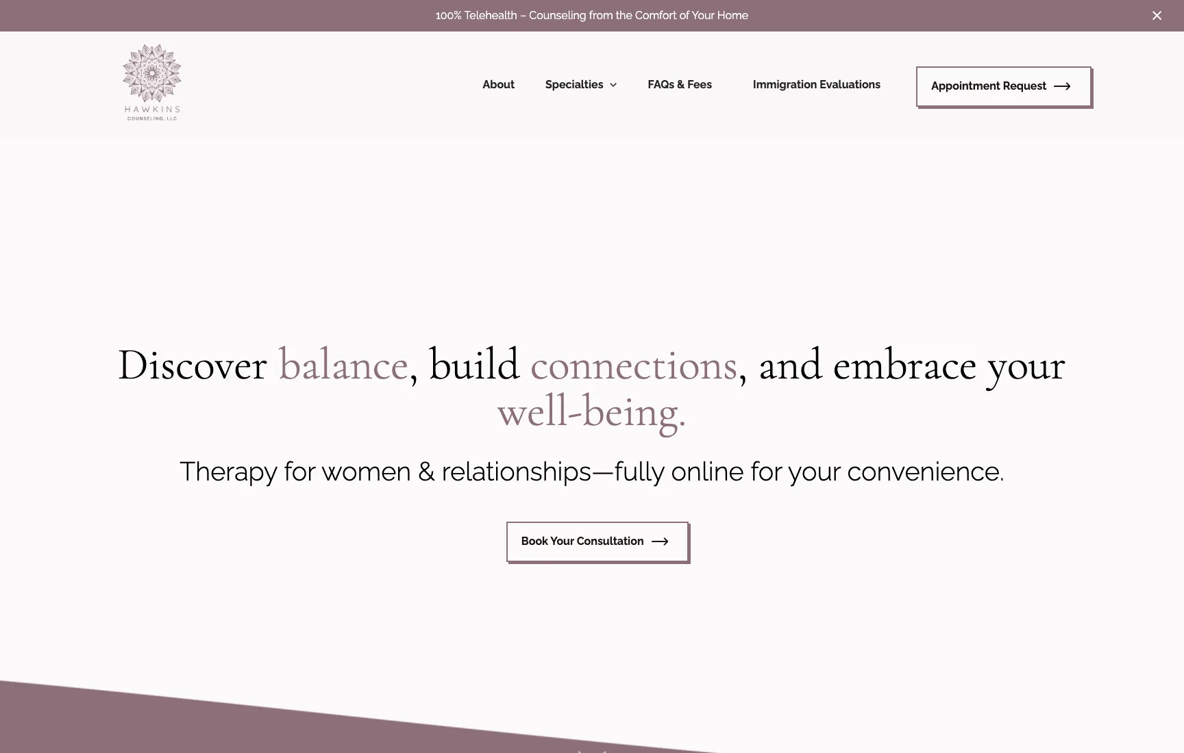
Why Kim Hawkins Counseling Feels Clear and Actionable
Kim Hawkins Counseling stands out because it does not stay vague. The site gives visitors multiple ways to understand the practice and encourages them to take a next step without making the process feel heavy.
Clear trauma and EMDR positioning
Even from the title and homepage framing, the site tells visitors what kind of support they are likely to find here. That kind of specificity helps the right client self-select much faster.
Multiple clear entry points
Specialties, FAQs and fees, immigration evaluations, and a start-here style call to action all appear early. That gives different types of visitors a clear place to go depending on what they need.
Practical trust-building information
Visible fee and FAQ pathways matter. They reduce uncertainty and help the site feel useful, not just polished. That is especially important for therapy practices where hesitation often comes from unanswered practical questions.
The takeaway
This site is a good example of how therapist websites can feel both compassionate and highly usable at the same time.
Anchored Counseling
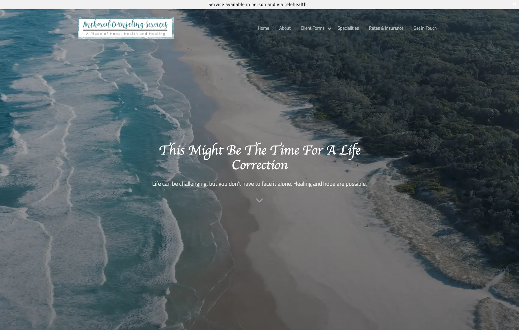
Why Anchored Counseling Feels Experienced and Credible
Anchored Counseling leans into calm authority. The homepage communicates care, but it also makes qualifications and services easy to see, which helps the practice feel established and trustworthy.
Grounded positioning from the start
The homepage message is direct and steady. It does not try to do too much, and that restraint works in its favor. It feels like a site built for clarity rather than marketing noise.
Credentials and qualifications are visible
A lot of therapist sites wait too long to show experience. This one makes qualifications easier to find, which helps reassure visitors who are still deciding whether they trust the practice.
Rates and insurance reduce friction
The site also surfaces practical information like rates and insurance. That matters because cost and logistics are often part of the decision long before someone fills out a contact form.
The takeaway
Anchored Counseling is a strong example of a therapist website that balances warmth with professional credibility.
Sarah C. Benoit
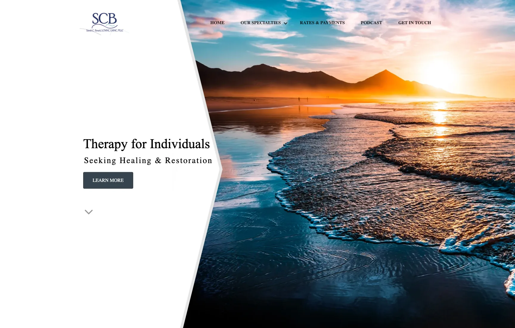
Why Sarah C. Benoit’s Website Feels Calm and Focused
Sarah C. Benoit’s website works because it stays simple. It does not overload the homepage with too many competing ideas. Instead, it gives visitors a calm structure and a clear sense of professionalism.
A simple first impression
The homepage feels clean and emotionally steady. For therapy websites, that kind of simplicity can be a strength because it helps the visitor focus on the message instead of the layout.
Specialties are easy to spot
The site quickly signals that there are clear focus areas to explore. That helps visitors answer the most important question early: “Is this therapist likely to be a fit for me?”
Professional without feeling cold
The tone feels credible and composed, but it does not become distant. That balance is hard to get right, and this site handles it well.
The takeaway
This is a strong example of how a therapist website can feel polished and trustworthy without becoming cluttered or overbuilt.
Your Growth Space
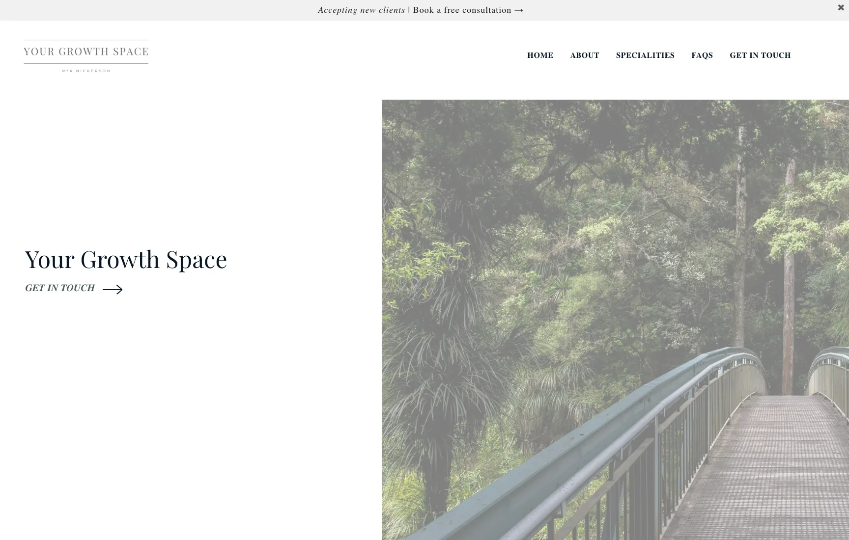
Why Your Growth Space Feels Specific and Helpful
Your Growth Space stands out because it gives visitors helpful context early. The homepage makes the therapist’s audience, specialties, and location easier to understand without feeling overwhelming.
Clear niche and audience fit
The site quickly tells visitors who the practice is and where it is based. That may sound simple, but it is one of the most important jobs a therapist homepage has.
Strong specialty breakdown
The homepage gives structure to the areas of practice instead of burying them. That creates clarity for visitors who are scanning to see whether they should keep reading.
Useful FAQ and care-format context
The FAQ and contact-oriented sections make the site feel practical. When a therapist website answers real questions early, it lowers hesitation and makes the next step feel more manageable.
The takeaway
Your Growth Space is a good reminder that specificity is often one of the fastest ways to make a therapist website more effective.
What the Best Therapist Websites Have in Common
These five websites are different in style, but they share the same core strengths. They build trust early, make specialties easier to understand, and reduce friction for people who are already deciding whether to reach out.
The strongest therapist websites do not just look professional. They help the right clients feel oriented, reassured, and clear on the next step.
If your current site is too vague, outdated, or hard to navigate, studying examples like these is a smart place to start. And if you want help building a therapist website that feels clear, credible, and easy to act on, PremPage can help.